Publication and Cover Design
Books are like a second language to me, both the words and the design. At the University of Houston-Victoria, the publication design class studied mostly the interior design of a book and thinking of golden ratios within the pages. Below is a fictional literary magazine and a case study for Lisa Rogal’s la belle indifférence, a collection of poems about want and desire geared towards honoring women's empowerment, along with two cover designs for two different books: The Shady Glen Sanctuary and When the Pines Grew Tall.
TRÈS LITERARY
TRÈS LIT is a fictional literary magazine that focuses on real and honest writing and art. Composed for a capstone project, the task was so enjoyable because I got to reach out to local writers and artists to help contribute to the over all look and feel, while also including my own writing. Check out the full issue here.


Easy reading
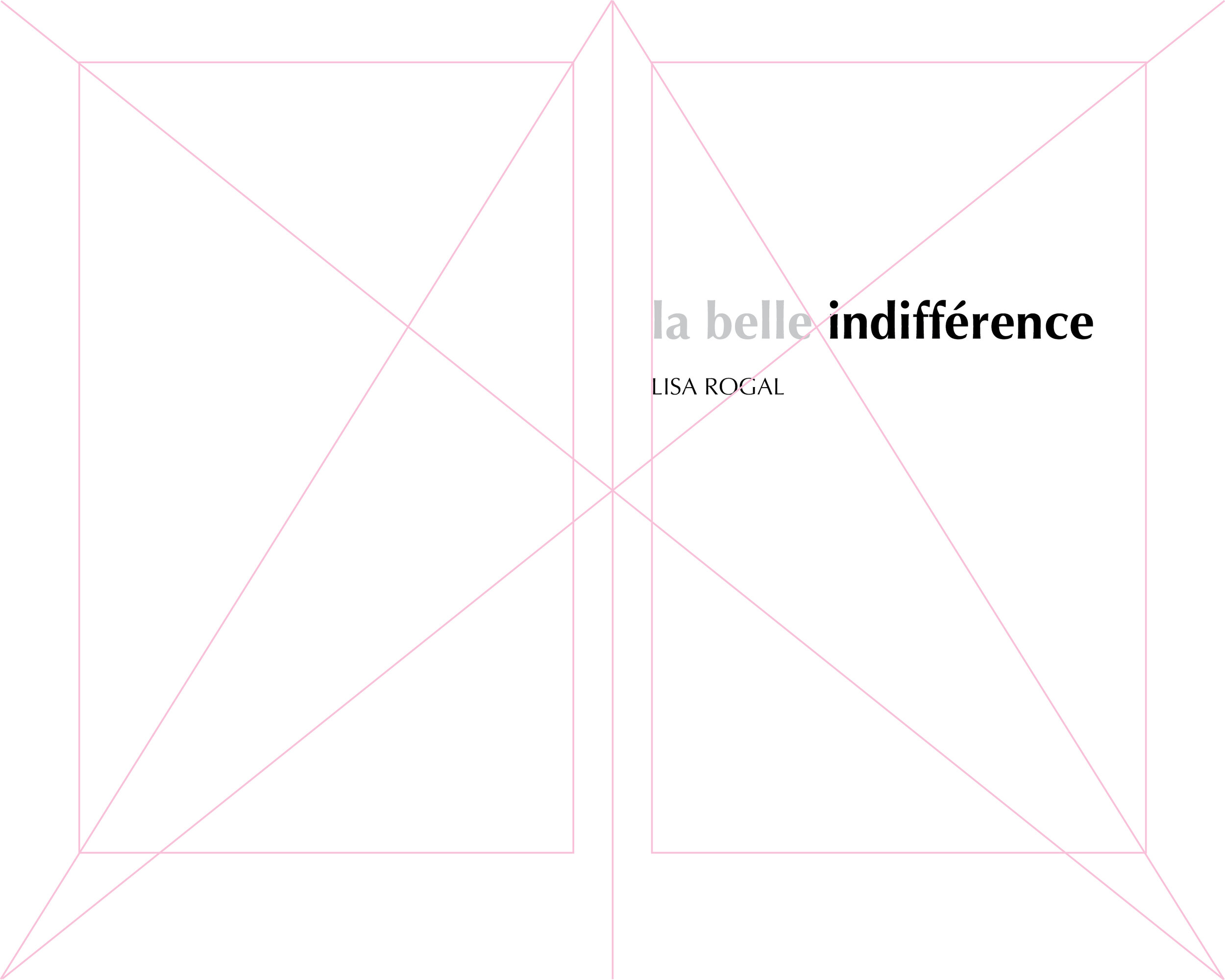
The author’s style and topics went into play in designing the layout of the book. Below is the grid I used in Adobe InDesign to layout the first few pages. I was inspired by other poetry and prose books with simplicity and focus on certain words to help support the theme and topics of the author’s book.


Typography
The author of this case study was specific about wanting a sans serif font, which is not traditional in printed books of poetry. After researching, I chose Optima, a unique typeface that offers a different aesthetic than a typical sans serif font. It reads well on paper and offers various styles within the font.

This book design is based on my current fictional work-in-progress manuscript. This novel follows two young students as they complete a science project watching birds in the swamps of a bird sanctuary. Sometimes, when I feel stumped in the writing world, I go to my art to try and express my creativity another way.
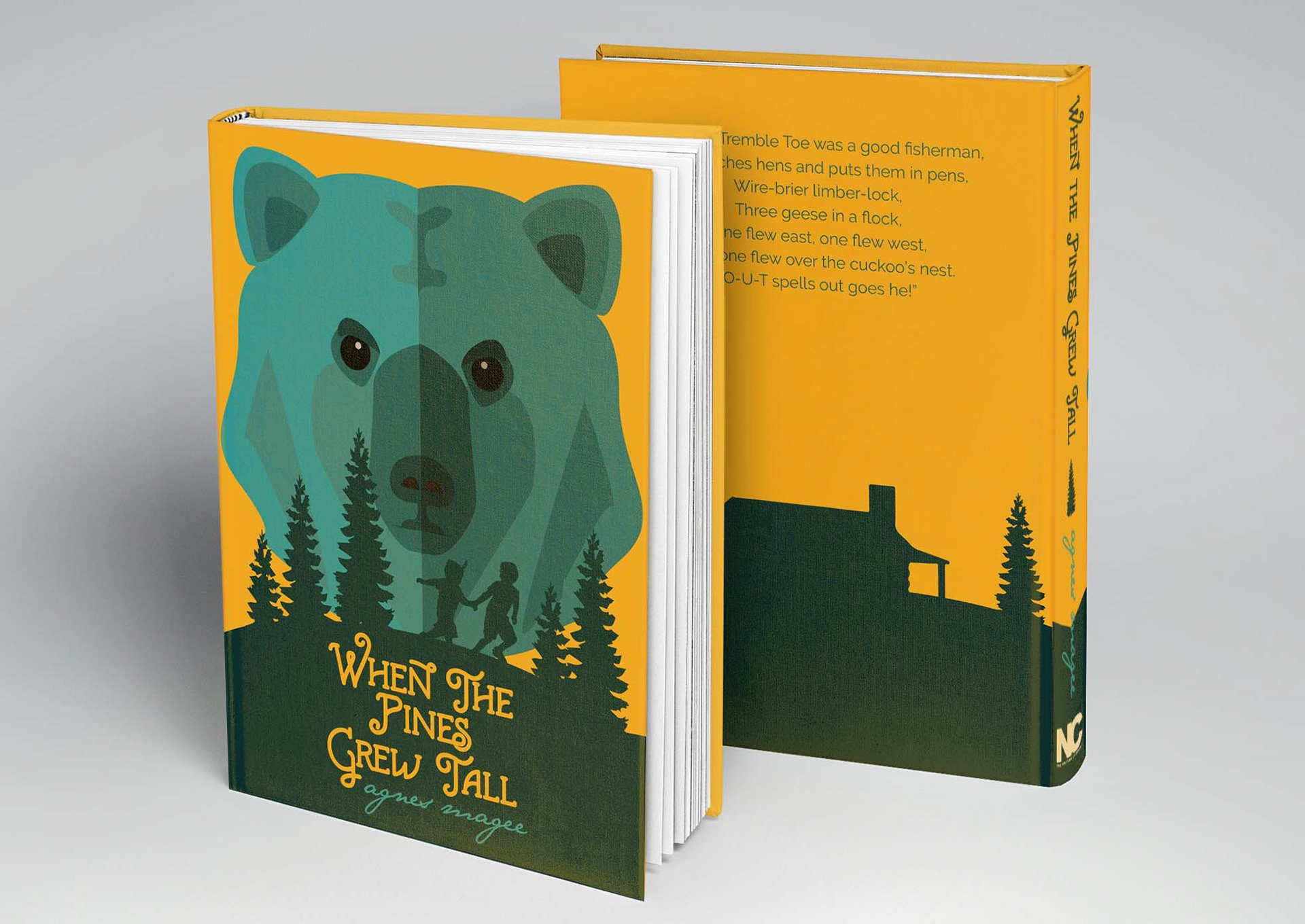
When the Pines Grew Tall is a children's historical fiction novel about two little boys from two different worlds who encounter many different adventures in east Texas. The treatment of the book jacket was to create an illustration of the scene when Jim and White Feather encounter the bear; however, it is a children's novel. So, a lighter color palette chosen for this scene helped illustrate a lighter feel of the bear and young children escaping the bear, while also being able to illustrate the setting of the book. Also, placed on the back, is a riddle that was repeated throughout the time period, that is said in the book, to create another eye-catching aspect for children.