
Data
Made Easy
Something I love to create is infographics that turn complex data into clear and attractive visuals. I try to make information easy to understand and meaningful through good design and storytelling, letting the audience understand the data better.

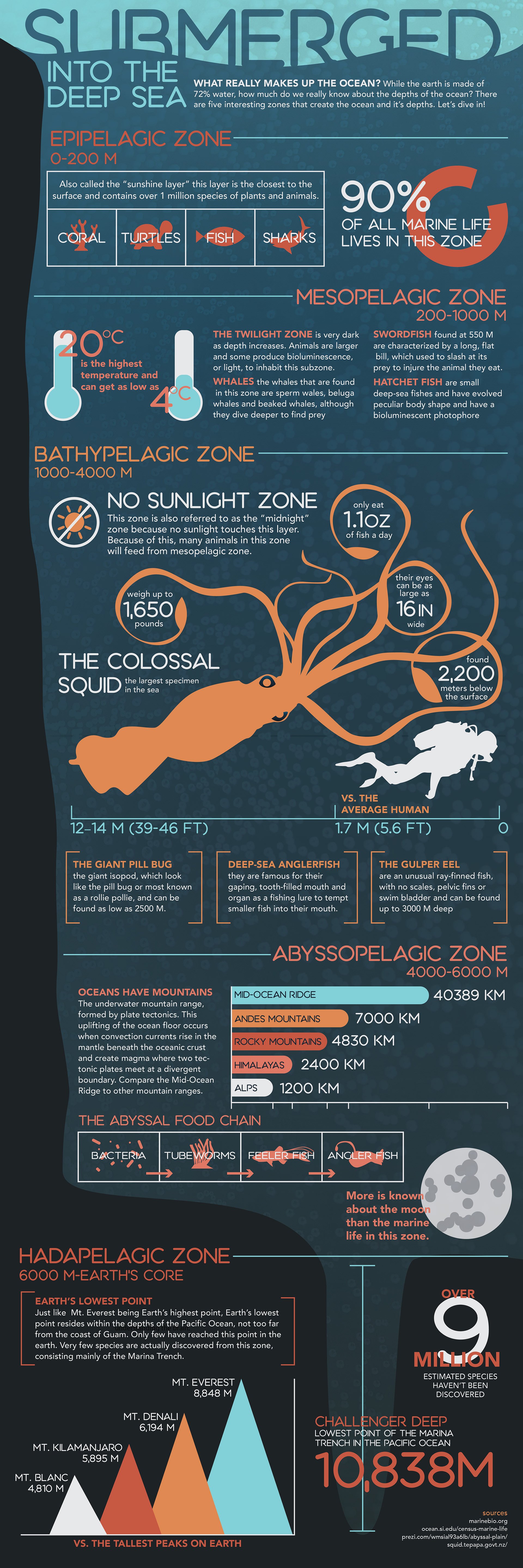
What really makes up the ocean? While the earth is made of 72% water, how much do we really know about the depths of the ocean? There are five interesting zones that create the ocean and its depths. This infographic was created to inform a reader of the different layers within the ocean and what each zone actually contains. Designed in AfterEffects, the infographic was converted into a motion graphic short available below. Let’s dive in!
Other infographics and design can be found in my publications of Community Impact Newspaper here: